Skip to content
Journal

Ideas For A Beautiful Wedding.

Practical, considered writing on invitations, films, portraits and the ten days before the day itself.

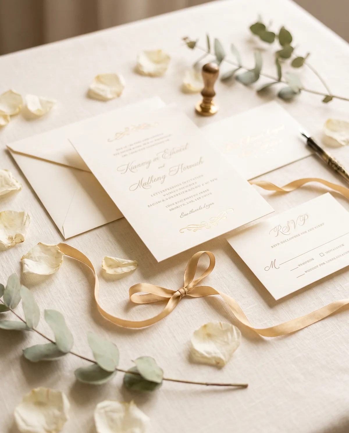
Cream wedding invitation suite with gold foil on linen
Invitations

Digital Wedding Invitation Ideas

The best digital invitations are not printed cards photographed on a phone. They are designed for the screen they will be read on — and for the family group they will be forwarded into.

A digital invitation has one job that a printed card never had: it must survive being forwarded. It will be compressed, screenshotted, opened on a five-year-old phone with the brightness turned down, and read by someone standing in a kitchen. Design for that and everything else follows.

Start with the shape of the screen

Most guests will see your invitation as a portrait image in a chat window. That is a tall, narrow frame — so build the layout vertically rather than trying to shrink a landscape card into it. Give the names the top third, the date and venue the middle, and the function schedule the lower half where the eye naturally travels last. Leave a wide margin. Space reads as confidence; a crowded card reads as a flyer.

One typeface family, two sizes

The fastest way to make an invitation look expensive is to use fewer typefaces, not more. A single serif at two sizes — large for names, small for details — will always look more composed than three fonts competing. If you want contrast, get it from scale and space rather than from a decorative script that will not survive compression.

Make it legible for elders

Someone in your family will read this at arm's length without their glasses. Keep body text well above the size you think you need, avoid pale grey on cream for anything that matters, and never set the venue address in a script face. If the date and the address cannot be read in one glance, the design has failed however beautiful it looks.

Design the functions as a sequence

Mehendi, haldi, sangeet, the ceremony, the reception — each has its own mood, and a good suite lets them differ without falling apart. Keep one palette and one typeface across all of them, then change a single element per card: the photograph, the accent colour, the ornament's position. Guests should be able to tell the cards apart at a glance and still recognise them as one family.

Give people the versions they need

Ask for a portrait file for chats, a square for Instagram, and a wide crop for anyone who wants to display it. A separate plain-text message with the address and map link is worth more than any design flourish, because that is the message people will search for on the morning of the wedding.

Leave the ornaments out

Restraint dates better than decoration. Ten years from now, the invitation you will still like is the one that trusted your names to carry it.
Design My Invitation →

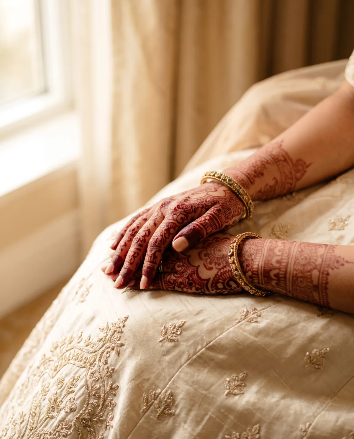
A bride's henna-adorned hands on ivory silk
Personalisation

How To Make Your Wedding Invitation Feel Personal

Personal is not a photograph of the two of you added to a template. It is the small specifics only your families would know to include.

Most invitations are personalised in the weakest possible way: the names are swapped, a photograph is dropped in, and everything else stays exactly as the template intended. Guests can feel it. What makes an invitation feel like yours is specificity — details chosen because they are true of your wedding and would be wrong for anyone else's.

Write the names the way your family says them

Decide early whether you are using full names, the names people actually call you, or both. Decide how each family's elders are named and in what order. Get the spelling from the person it belongs to rather than from a WhatsApp message typed in a hurry. This single decision does more for warmth than any design choice.

Let the venue choose the palette

If you are marrying in a sandstone courtyard at four in the afternoon, warm ochre and cream will feel inevitable. If it is a garden at dusk, a cooler green and ivory will. Taking the palette from the place means the invitation and the photographs will eventually sit together instead of arguing.

Include one line that is only yours

The street where you met. The city you both left. A line from a song you have played too many times. One sentence of specificity, set small and quietly at the foot of the card, does more than a paragraph of romantic language written for anyone.

Respect both sides

Two families rarely word things the same way. If one side wants a formal invitation and the other something warmer, do not average them into something bland — give each its own card in the same design family, or set both languages properly rather than reducing one to a footnote.

Design the order of information around your day

If the sangeet is the celebration everyone is travelling for, it should not be third in a list. If the ceremony is at an hour guests will find unusual, say so warmly and clearly rather than burying it. The hierarchy of your card should match the hierarchy of your wedding.

Photographs are optional

A beautiful invitation does not require a picture of you. If your photographs are not yet taken, or you would rather they stayed private, typography alone can carry the entire card. That, too, is a personal choice worth making deliberately.

Make Mine Personal →

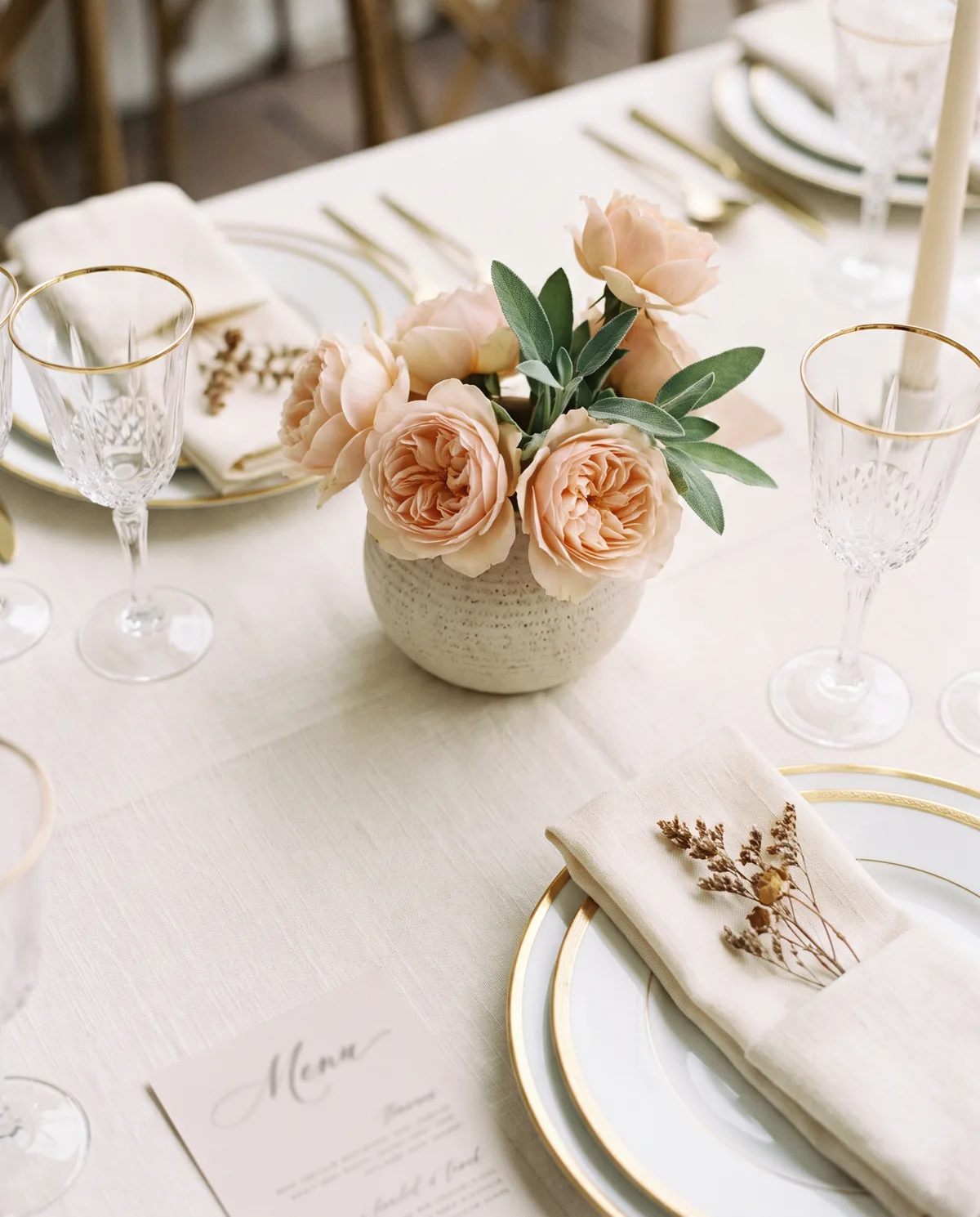
Ivory table setting with blush garden roses
Countdown

10 Days Before Your Wedding

The last ten days are the ones everyone remembers feeling. Given a shape, they become part of the celebration rather than a scramble.

Ten days before a wedding, two things happen at once. The logistics reach their peak, and so does the feeling. Most couples handle the first and let the second pass unmarked. A countdown is simply a way of making room for the feeling — and of letting the people who cannot be with you every day share it.

Give each day a subject

A countdown that only says a number is a reminder, not a story. Give each day something to be about: your story, the venue, the family, the function that matters most, the friends who have travelled. Ten subjects turn ten posts into a series people follow.

Make it all before day ten

The single most useful rule. Whatever you plan to share should be finished, written and saved in one folder before the countdown begins. In the last week you will not have the time or the attention to design anything, and the days you miss will be the ones you most wanted.

Write the captions in advance too

A good caption is short and specific: one sentence that says something true. Write all ten in a single sitting, when you are calm, and edit them then. It is far easier to be warm on a quiet afternoon than at midnight after a fitting.

Mind the format

Stories and status updates are vertical; the feed is square. Prepare both so you are not cropping something beautiful into something awkward at the moment of posting. Keep text well inside the safe area so nothing is clipped by the interface.

Include the family

The countdown days that land hardest are rarely about the couple. A photograph of your parents at their own wedding, a note about the aunt who is cooking for two hundred people, the cousins arriving from three cities — these are the posts people screenshot and send to each other.

Keep the last two days quiet

By day two, everyone knows. The final pieces should be the simplest: a line, a date, a single image. Save your loudest design for the middle of the countdown and let the end be still. It reads as confidence, and it matches how the last two days actually feel.

Create My 10-Day Countdown →

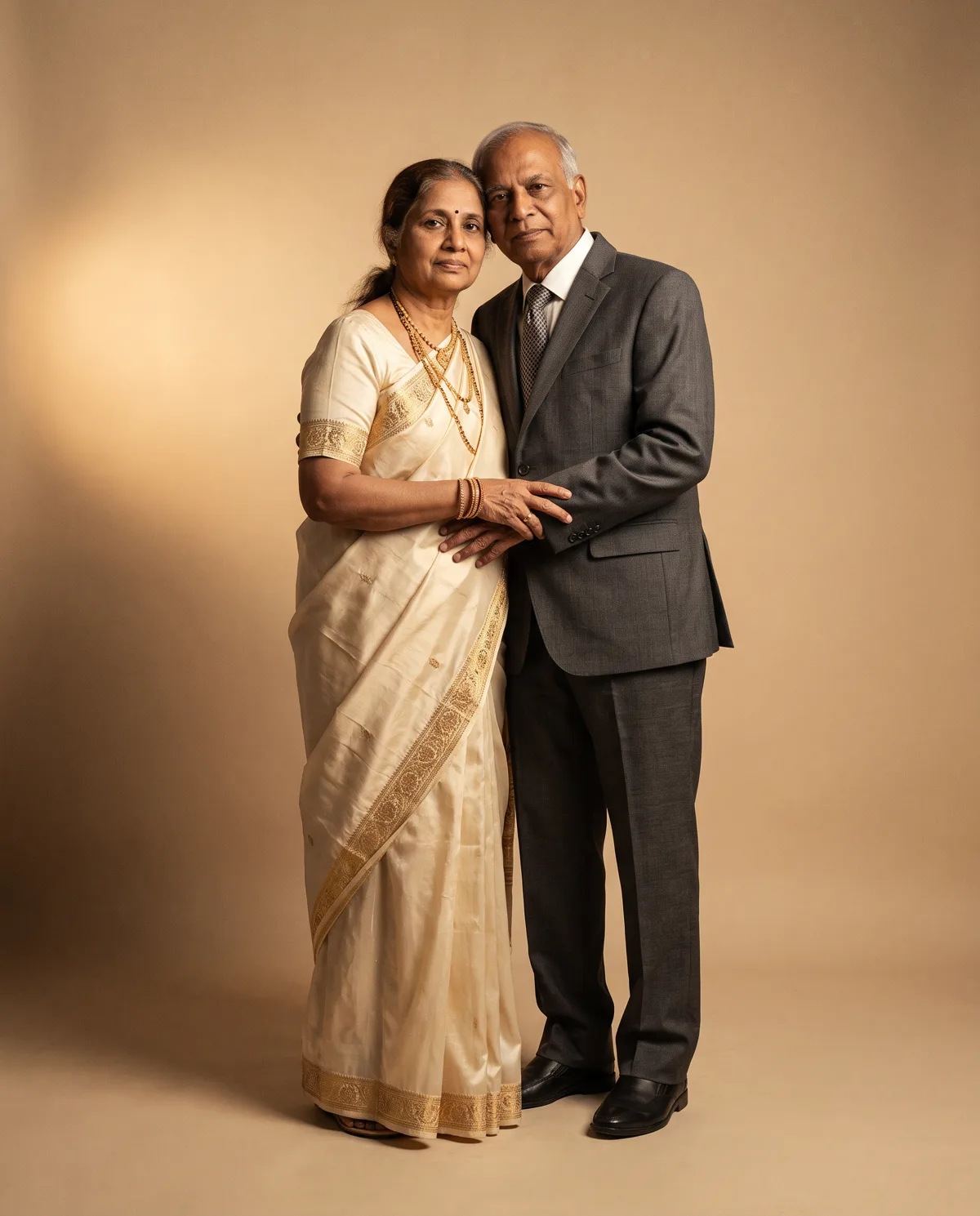
Editorial studio portrait of a couple in ivory and charcoal
Portraits

AI Wedding Portrait Ideas

Used well, AI portraits look photographed. The difference is entirely in the direction you give them before anything is generated.

The portraits that work are the ones that could plausibly have been taken. The ones that do not are the ones that reach for spectacle — impossible light, dramatic skies, an aesthetic nobody would have asked a photographer for. The brief matters more than the tool.

Choose a setting you would actually book

A sandstone courtyard. A quiet studio with a warm backdrop. A garden in the last hour of light. A staircase in an old hotel. If you would happily have hired a photographer to shoot there, it will look believable. If it exists only in a film poster, it will not.

Take the wardrobe from your real wedding

Ivory and gold, deep red, sage and cream — matching the portraits to your actual outfits makes them sit naturally beside your wedding photographs later. It also keeps the invitation, countdown and portraits in one palette without any extra effort.

Send better source photographs

Good input is most of the result. Choose images that are sharp, well lit and taken close enough that faces are clear. Include a few angles and expressions, avoid heavy filters and sunglasses, and send the originals rather than pictures already forwarded three times.

Ask for fewer, better images

Four portraits you love will do more for your wedding than forty you scroll past. Decide what each one is for — the invitation, the countdown, a print for the house, the website header — and brief them individually.

Keep the retouching honest

The aim is you, photographed beautifully, not a smoothed version of someone else. Ask for skin, fabric texture and real shadows to be kept. The moment a portrait stops looking like you, it stops being worth having.

Think about the crop before you generate

A portrait meant for an invitation needs space around the couple for type. One meant for a story needs room at the top and bottom. Deciding this first saves you from loving an image you cannot actually use.

Create My Portraits →

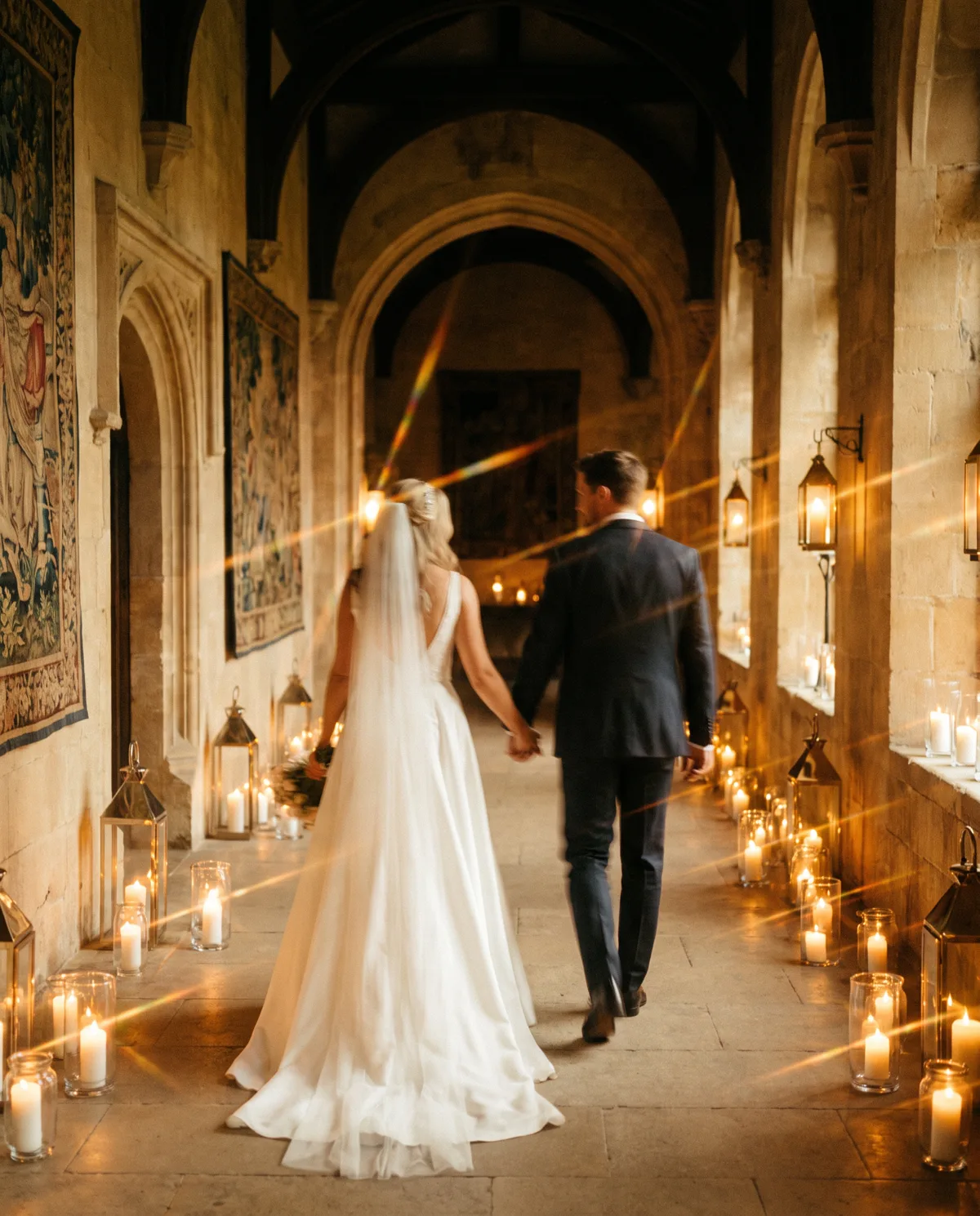
A couple walking through a candlelit corridor
Comparison

Digital Wedding Invitation vs Video Invitation

One is read, the other is watched. Choosing well depends on who your guests are and what you need them to remember.

Couples usually ask which is better. The more useful question is which one your guests will use — because these two pieces do genuinely different jobs, and most weddings are best served by having both.

What a still invitation does well

It can be read at a glance, saved to a gallery, zoomed into, and found again three weeks later by scrolling back through a chat. Nobody needs sound, patience or a good connection. For the practical information of a wedding — dates, timings, addresses — a still card is simply more reliable.

What a video invitation does well

It creates feeling. Motion, music and pacing let the wedding arrive as an experience rather than a notice, and details revealed one at a time are remembered better than a list. It is the piece that gets forwarded with a comment attached, which is exactly what you want when you are announcing.

Where video struggles

Sound is often off. Video is heavy on poor connections. It cannot be scanned — a guest looking for the venue at speed will not scrub through forty seconds to find it. And elders are far more likely to save an image than a file they must open and play.

The sequence that works

Announce with the film, inform with the card. Send the video first, when the news is new and the emotion is the point. Follow it in the same message with the still invitation carrying every detail, and a plain-text line with the address and map link. Together they cover both halves of what an invitation is for.

If you can only choose one

Choose the still invitation. It is the piece your wedding cannot function without, and a beautifully typeset card carries more quiet confidence than a rushed film. Add the video later if the budget allows — it works just as well as a countdown piece a week before the wedding.

Keep them in one design family

Whatever you choose, the film and the card should share a palette, a typeface and a mood. Two beautiful pieces that look unrelated read as two different weddings.

Talk About Both →

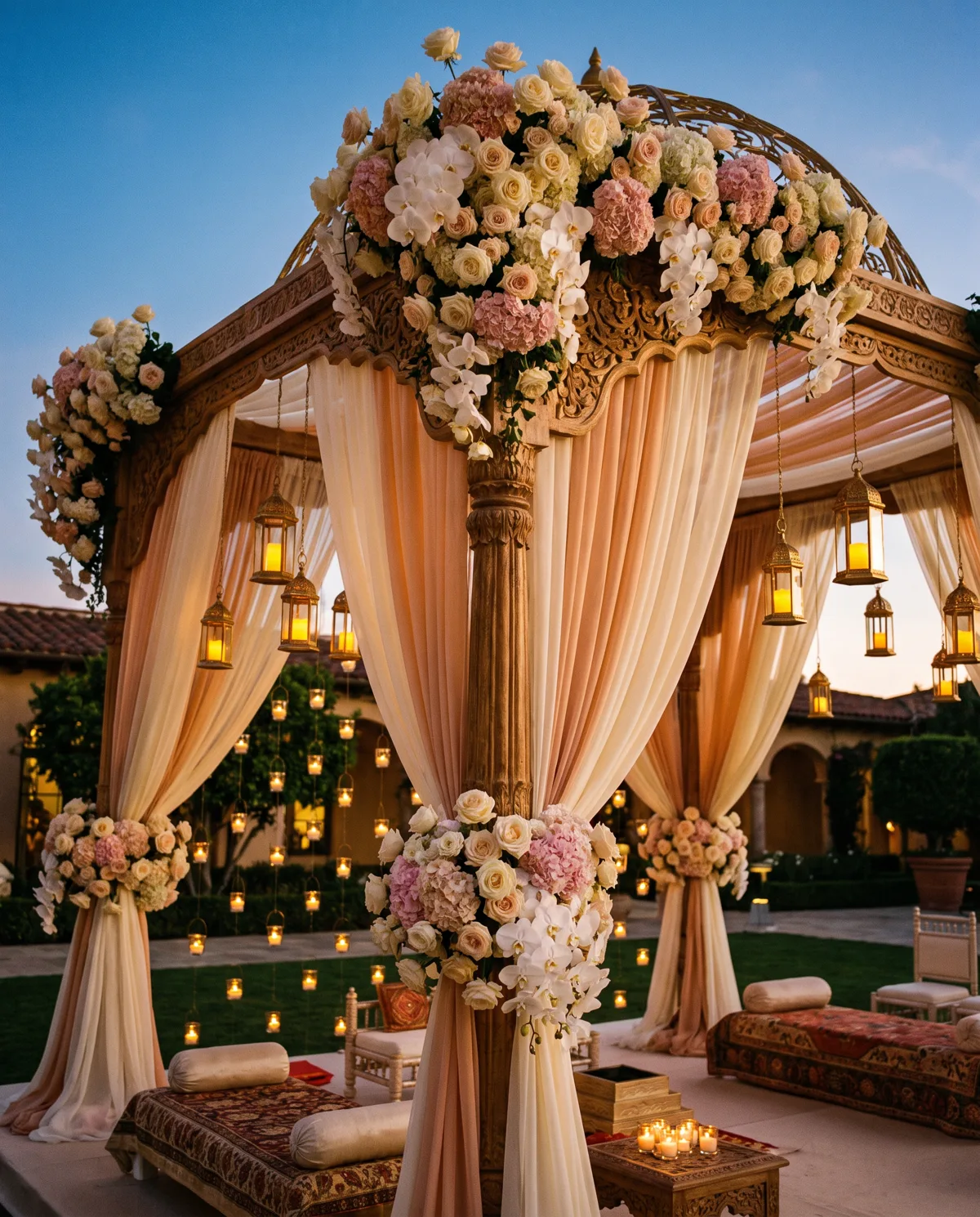
A floral mandap lit by lanterns at dusk
Wedding Websites

Wedding Website Ideas

A wedding website earns its place by answering the questions you would otherwise answer two hundred times.

A wedding website is not a vanity project. It is the single link you send when someone asks what time the ceremony starts, whether there is parking, what to wear to the mehendi, and which hotel everyone is staying in. Build it around those questions and it will save you more time than anything else you make.

Put the essentials above everything

Names, date, city. Then each function with its time, venue, map link and dress code. A guest should find the answer within one screen of arriving, on a phone, without tapping into a menu.

Write a travel page for the guests who need it

The nearest airport and station, how long the drive takes, two or three hotels at different prices, and whether transport is being arranged. Out-of-town guests will read this page more carefully than any other, and it removes dozens of individual messages.

Tell the story briefly

Two short paragraphs about how you met and how you decided, with one good photograph. Long enough to be warm, short enough that people finish it. This is the part guests read while waiting for something else.

Use an RSVP page properly

Ask for the number attending, which functions they will come to, and any dietary notes. Keep it to a handful of fields — every extra question loses replies — and set a clear closing date so caterers can be confirmed.

Let the gallery grow

Start with a small set of considered images and add to it as the celebration unfolds. A gallery updated the week after the wedding gives guests a reason to return, and gives you one link to share instead of forty files.

Match it to your invitation

Same palette, same typeface, same tone of voice. When the card, the film and the website look like one thing, the wedding feels planned rather than assembled — and that impression begins long before anyone arrives.

Build My Wedding Website →


Have An Idea Of Your Own?

Tell us what you have pictured for your wedding and we will tell you how we would make it.

Chat With GrovWeds